You know you’re at a geek-oriented film festival when the program provides information About the print before telling you About the film. “The film is in excellent condition, with deep, rich contrast and very little scratching or damage. Shrinkage: 0.63%.”
The Nitrate Picture Show, which I attended last week, is as much about the prints as the films. These are unstable, highly-flammable nitrate prints that stopped being made in the early 1950s.
Having spent three days watching projected nitrate prints, I can tell you that these are a thing of beauty – especially in black and white. The grays have a deep richness all their own, as if the images were etched in silver. That shouldn’t be surprising, since black-and-white nitrate prints had a very high silver content. The color films were also beautiful, but not as exceptional.
One other issue may have contributed to the films’ beauty. These films were made and released at a time when release prints were made directly from the original camera negatives. In recent decades, release prints are usually three generations from the original.
Here are the movies shown on Friday, May 4:
Nitrate Shorts

What better way to introduce nitrate projection than a group of shorts? This collection had films in black and white, Technicolor, Cinecolor, and tinted black and white.
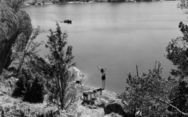
The series started with Arne Sucksdorff’s Symphony of a City (image above), a gorgeous black-and-white, 11-minute study of the people of Stockholm. The other shorts weren’t much artistically, but the color travelogues gave us a view of how Cinecolor and Technicolor once looked.
A truly dreadful recruitment short, Our Navy, gave me my first chance to see a tinted, nitrate print of a silent film projected onto a screen. The last shot was both tinted and toned. This was also the oldest print they projected – from 1918.
Sommarlek (Summer Interlude)
This early (1951) Ingmar Bergman film wasn’t early enough for the PFA’s recent Bergman 100: the Early Years series. It’s a love story, set on a beautiful island in the summer, told in flashback. It’s not what you think of in Bergman, but it’s enjoyable, and yet very sad. One major plot twist felt false to me.
I’d give it a B.
The print was badly scratched at the beginning and end of every reel, but other than that, it was gorgeous. The subtitles were projected digitally and sometimes went out of sync—proof that they were being controlled live.
Holiday

This 1938 romantic comedy doesn’t seem quite crazy enough to be called a screwball comedy. On the other hand, it stars Cary Grant and Katharine Hepburn, and plays with class differences, so maybe it is a screwball. Either way, it’s very funny. For once, Edward Everett Horton gets to play an intelligent character, and yet he can still be amusing. It isn’t Bringing Up Baby, and its stage origins show occasionally, but it’s very much worth seeing.
I’d seen it before, long ago, and was delighted to be reacquainted with it.
Holiday was directed by George Cukor, from a script by Donald Ogden Stewart and Sidney Buchman, adapted from Philip Barry’s play. I give it an A-.
The sepia-toned print had some minor problems, including what looked like raised areas on the image. I asked Collection Manager Deborah Stoiber about it after the screening. She told me that the sepia was not smoothly applied. But it still looked lovely.
